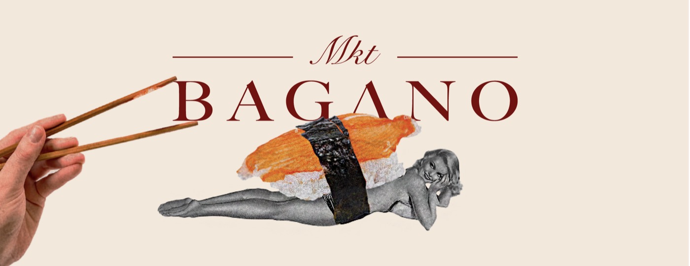
Bagano MKT
Context
Highly saturated food market where most brands rely on short-term promotion and interchangeable visuals.
Concept
Bagano was built as a cultural definition rather than a restaurant brand. The goal was to move beyond traditional identity and position the brand as an active voice within food culture.
Approach
As co-founder and creative lead, I was responsible for defining the brand direction and leading its execution across multiple fronts.
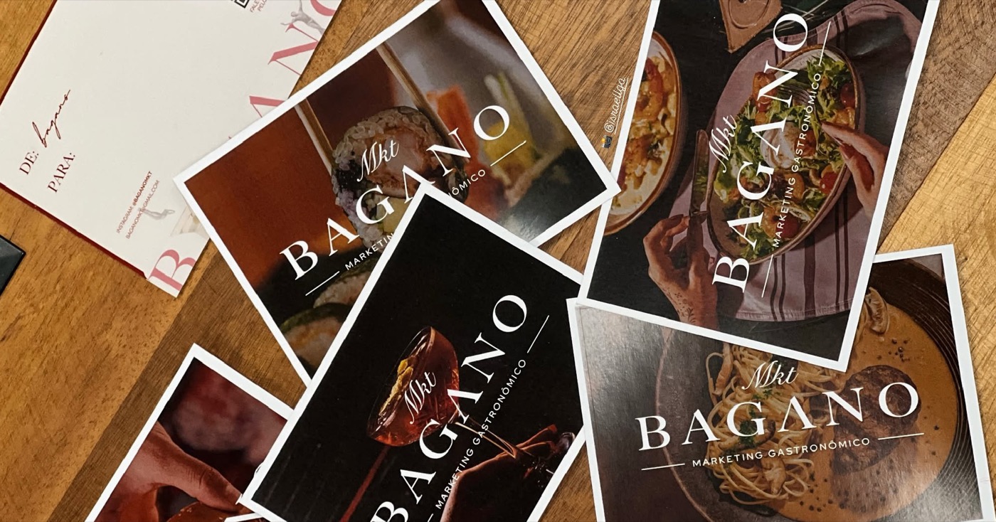
- Developed the visual identity system, combining structured typography with expressive collage to balance consistency and flexibility
- Defined the brand positioning beyond restaurant → cultural platform
- Built a scalable system designed to operate across content, events and physical touchpoints
- Led and directed creative output, aligning design, content and video into a cohesive brand voice
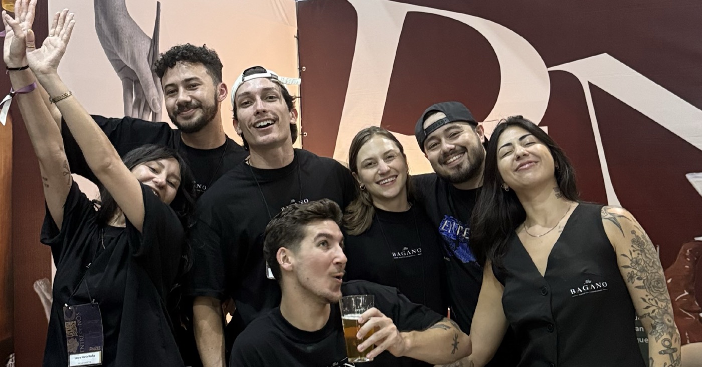
- Structured workflows to enable high-frequency content production without losing consistency, including real-time coverage during events such as Congresso Raízes
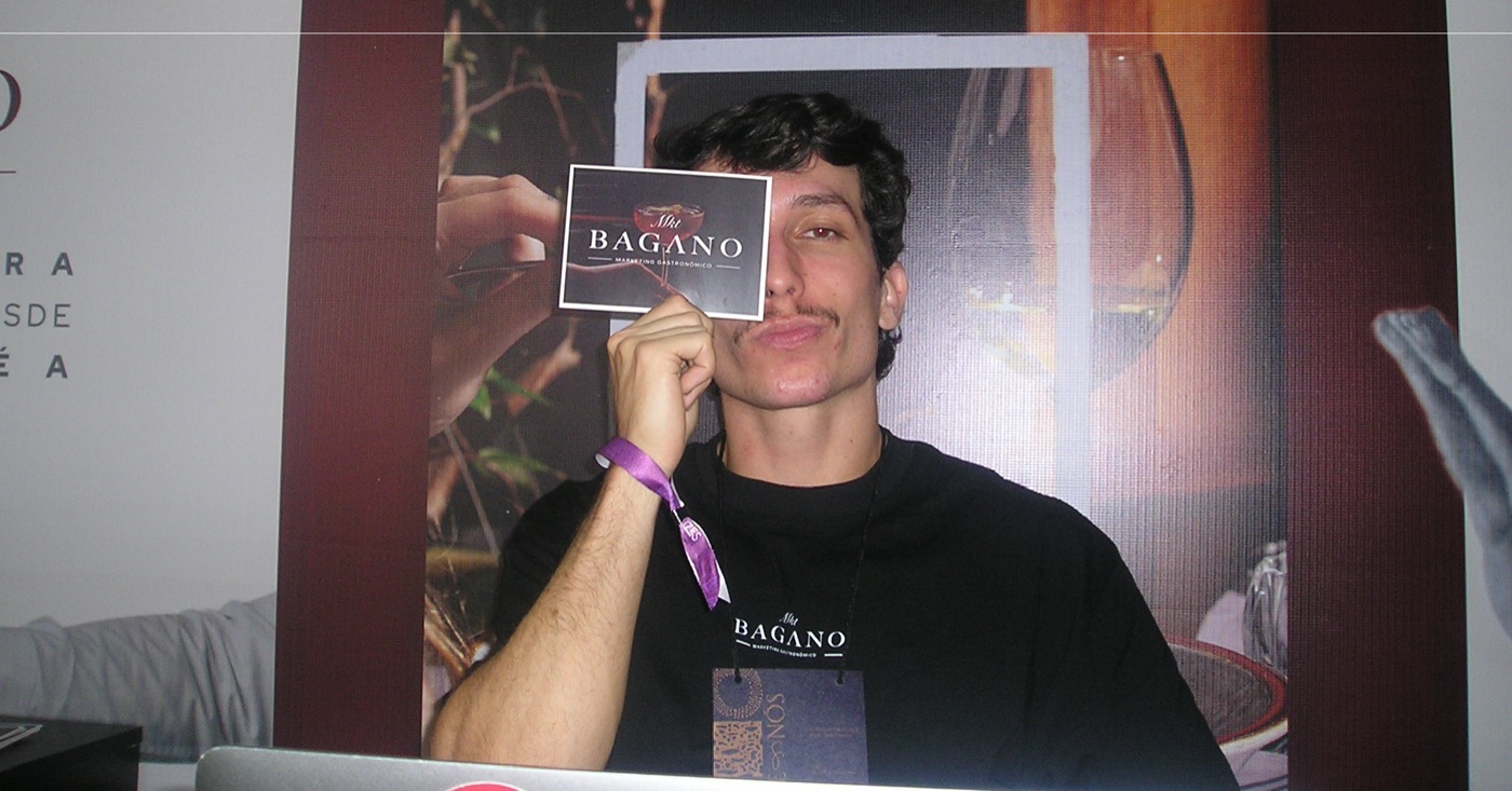
🎉 +25,000
People reached across events
📈 Recognition
Increased within a saturated market
🔥 Engagement
Driven by culturally relevant content
⚡ Scalable
Supporting continuous content and brand growth
A scalable brand system designed to operate across content, culture and real-time execution.